d.vect map=streets color=179:179:179:255 width=1 legend_label="Wake Forest streets"
d.vect map=schools where="GLEVEL='H'" color=0:29:57:255 fill_color=255:0:0:255 width=1 icon=basic/circle size=25 legend_label="high schools"
d.vect map=schools where="GLEVEL='M'" color=0:29:57:255 fill_color=255:255:0:255 width=1 icon=basic/circle size=20 legend_label="middle schools"
d.vect map=schools where="GLEVEL='E'" color=0:29:57:255 fill_color=0:0:255:255 width=1 icon=basic/circle size=15 legend_label="elementary schools"Making Thematic Maps
beginner
intermediate
GUI
raster
vector
thematic maps
legend
This tutorial guides a user through multiple ways of creating thematic maps with raster and vector GIS data.
Thematic maps are the most common form of analytical visualization done in GIS software. A thematic map uses color, or object shape or size, to represent geographic variation in some property, represented by categorical or numerical values in spatial data.
Most GIS software supports the creation of thematic maps from vector objects (points, lines, and areas). GRASS likewise enables the creation of thematic maps from vector data. It also supports the creation of thematic maps from rasters, which represent space as a grid of cells or pixels.
In this tutorial, we will explore the creation of thematic maps from both vector and raster geospatial data.
NoteDataset
This tutorial uses one of the standard GRASS sample data sets: nc_basic_spm_grass7. We will refer to place names in that data set, but it can be completed with any of the standard sample data sets for any region. Keep in mind that the specific vector map attribute columns may not be available for a map from a different location, and you may need to use other attribute columns.
This tutorial is designed so that you can complete it using the GRASS GUI, GRASS commands from the console or terminal, or using GRASS commands in a Jupyter Notebook environment.
NoteDon’t know how to get started?
If you are not sure how to get started with GRASS using its graphical user interface or using Python, checkout the tutorials Get started with GRASS GUI and Get started with GRASS & Python in Jupyter Notebooks.
Vector Thematic Maps
Thematic maps in the Layer Manager
Different colors and sizes to represent the value of a column
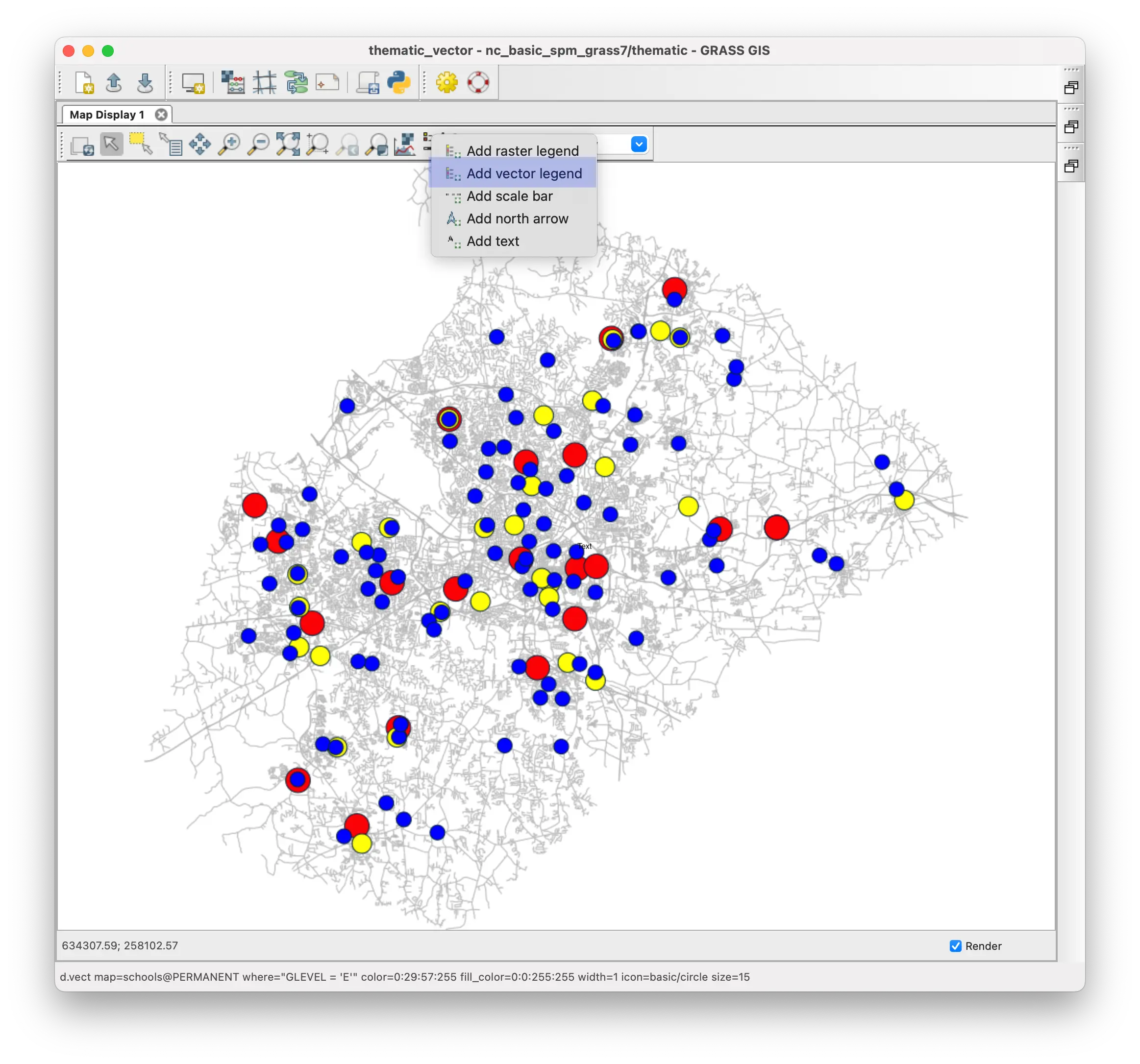
One of the easiest ways to create a thematic map is with the layer manager. In this method, each layer is a different theme. You can control the information displayed and vector object properties (e.g., color or size) for each layer using the vector properties tool, d.vect.
For example, we can display the schools vector points map—overlaying a vector map of streets to show where the schools are located—using different colors and sizes for different grade levels. The grade levels are recorded in the GLEVEL column of the schools attribute table by categorical values of E for elementary schools, M for middle schools, and H for high schools.
To do this, you simply need to display the streets map, and then the schools map in three additional layers.
For each layer, select a grade level to display and color and size of the symbol.
For each layer, you will also want to specify a label that will show up in a legend.
Streets layer
Display the streets map in the layer manager. In the vector properties, set the feature (line) color to grey to make it easier to see the school symbols. Click the layer properties button (or right click on the layer) for a contextual menu and select “Zoom to selected map(s)”.
Under Legend tab, set the “Label to display after symbol…” to Wake Forest streets.
High school layer
Display the schools map so it is above the streets map in the layer manager.
Open the vector properties tool for the schools map. Under the Selection tab, put the following query statement in the “Where” box. GLEVEL=‘H’. This will cause this layer to only display schools where the grade level is high school. You can also generate a query interactively by using the query builder button to the right of the entry box.
Click Apply (to display selected schools but not close the vector properties tool). Now you should only see the points representing high schools.
Under the vector properties Colors tab, set the “Area fill color” to red.
Under the vector properties Symbols tab, set the “Point and centroid symbol” to basic/circle and the “Symbol size” to 25.
Under Legend tab, set the “Label to display after symbol…” to high schools.
Click OK. Now you will see high schools represented by large red circles.
Middle school layer
Display the schools map again in a new layer above the high schools layer in the layer manager.
In the vector properties for this new schools layer, enter GLEVEL=‘M’ (for middle schools) in the Selection WHERE box, set the “Area fill color” to yellow, set the “Symbol size” to 20, and the legend lable to middle schools.
Click OK. Now, along with high schools, you will see middle schools represented by slightly smaller, yellow circles.
Elementary school layer
Finally, display schools a third time in a new layer above the middle schools layer in the layer manager.
In the vector properties for this layer, enter GLEVEL=‘E’ (for elementary schools) in the Selection WHERE box, set the “Area fill color” to blue, set the “Symbol size” to 15, and the legend lable to elementary schools..
Click OK. Now, along with high schools and middle schools, you will also see elementary schools represented by even smaller, blue circles.
gs.run_command("d.vect",
map="streets",
color="179:179:179",
width=1)
gs.run_command("d.vect",
map="schools",
where="GLEVEL = 'H'",
color="0:29:57",
fill_color="255:0:0",
width=1,
icon="basic/circle",
size=25,
legend_label="high schools")
gs.run_command("d.vect",
map="schools",
where="GLEVEL = 'M'",
color="0:29:57",
fill_color="255:255:0",
width=1,
icon="basic/circle",
size=20,
legend_label="middle schools")
gs.run_command("d.vect",
map="schools",
where="GLEVEL = 'E'",
color="0:29:57",
fill_color="0:0:255",
width=1,
icon="basic/circle",
size=15,
legend_label="elementary schools")Using different sizes (with larger symbols below smaller symbols), along with color, makes it easier to see where schools of different grade levels are co-located.

Creating a legend
A legend can help you and other users better interpret the colored circles on the map. You can create a vector legend with the vector legend tool, d.legend.vect, that you can access from the button bar at the top of the map display window.
The vector legend tool will create a legend with entries for all layers that are visible in a display. We can set a title and font, and control the background. But there are fewer options than the raster legend tool described in the section below for raster thematic maps.
Open the vector legend tool.
Under the title tab, set the “Legend title” to ‘Schools by Grade Level’ and the “Title font size” to 14.
Under the Background tab, check the “Display legend background” box.
Under the Font settings tab, set the “Font size” to 12.
Click OK to generate the legend.
d.legend.vect -b at=74.0,30 title="Schools by Grade Level" fontsize=12 title_fontsize=14
d.barscale -n at=70,10 length=10 units=kilometers segment=5 width_scale=2gs.run_command("d.legend.vect",
at="74.0,30",
title="Schools by Grade Level",
fontsize=12,
title_fontsize=14,
flags="b")
gs.run_command("d.barscale",
at="70,10",
length=10,
units="kilometers",
segment=5,
width_scale=2,
flags="n")Here is the map with a legend. A scale bar has been added using the scale bar tool, d.barscale, from the same button bar location as the vector legend tool. 
NoteTip
If you want to regenerate this thematic map in the future, you can do so quickly using GRASS commands.
Open the vector properties tool for each layer, click the Copy button and then paste the command generated into a text file.
Do the same for the vector legend tool and the scale bar tool.
This will create a file with the following sequence of commands (these can also be seen by clicking the “Command line” tab in this tutorial:
d.vect map=streets color=179:179:179 width=1 legend_label="Wake Forest streets"
d.vect map=schools where="GLEVEL='H'" color=0:29:57 fill_color=255:0:0 width=1 icon=basic/circle size=25 legend_label="high schools"
d.vect map=schools where="GLEVEL='M'" color=0:29:57 fill_color=255:255:0 width=1 icon=basic/circle size=20 legend_label="middle schools"
d.vect map=schools where="GLEVEL='E'" color=0:29:57 fill_color=0:0:255 width=1 icon=basic/circle size=15 legend_label="high schools"
d.legend.vect -b at=74.0,30 title="Schools by Grade Level" fontsize=12 title_fontsize=14
d.barscale -n at=70,10 length=10 units=kilometers segment=5 width_scale=2You can paste these commands into the GRASS GUI console one at a time, in this order to recreate this map.
You can use this same approach to create thematic area and line vector maps. Here is the census map showing household size in each census tract.
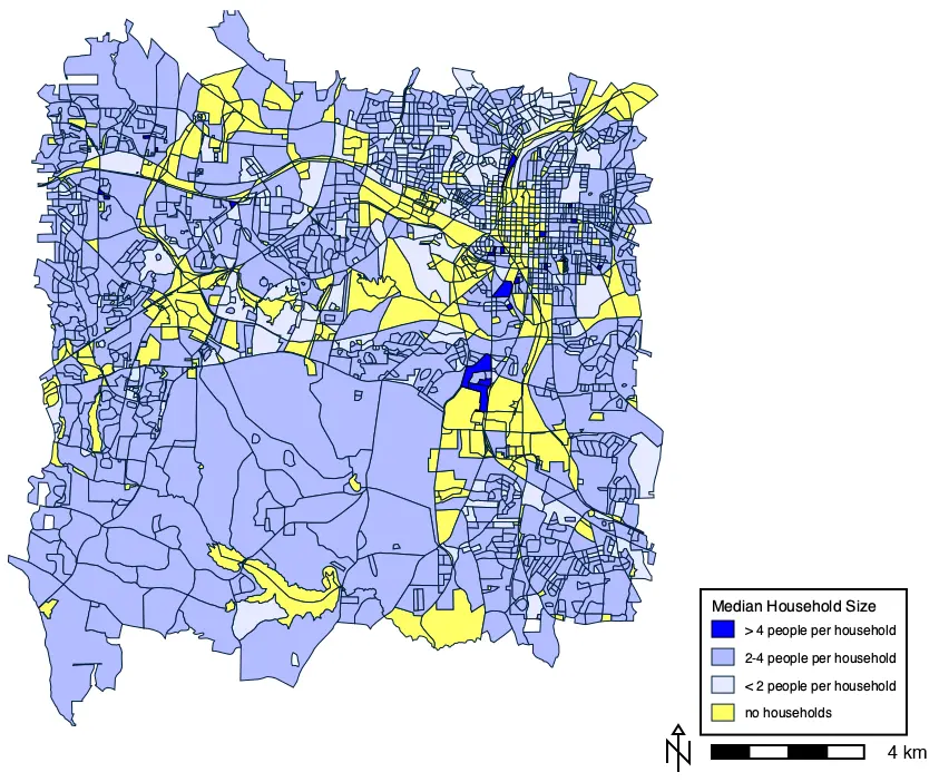
NoteCommands with settings to generate map
d.vect map=census@PERMANENT where=HH_SIZE=0 color=0:29:57:255 fill_color=255:255:102:255 width=1 icon=basic/circle legend_label=“no households”
d.vect map=census@PERMANENT where=“HH_SIZE>0 AND HH_SIZE<2” color=0:29:57:255 fill_color=230:234:255:255 width=1 icon=basic/circle legend_label=“< 2 people per household”
d.vect map=census@PERMANENT where=“HH_SIZE>=2 AND HH_SIZE <= 4” color=0:29:57:255 fill_color=178:188:255:255 width=1 icon=basic/circle legend_label=“2-4 people per household”
d.vect map=census@PERMANENT type=line,boundary,area,face where=“HH_SIZE>4” color=0:0:0:255 fill_color=0:0:255:255 width=1 icon=basic/circle legend_label=“> 4 people per household”
d.legend.vect -b at=75,25 title=“Median Household Size” fontsize=12 title_fontsize=14
d.barscale -n at=70.5,10 length=4 units=kilometers segment=4 width_scale=2
Statistically Derived Thematic Maps
Thematic mapping tool for choropleth maps
It can be useful to group continuous numerical values of a column into categories using various statistical measures of variability. The thematic mapping tool, d.vect.thematic, can do this using several statistical approaches, as well as supporting custom divisions. This tool only makes choropleth maps (i.e. using colors rather than symbol size for visualizing numerical values).
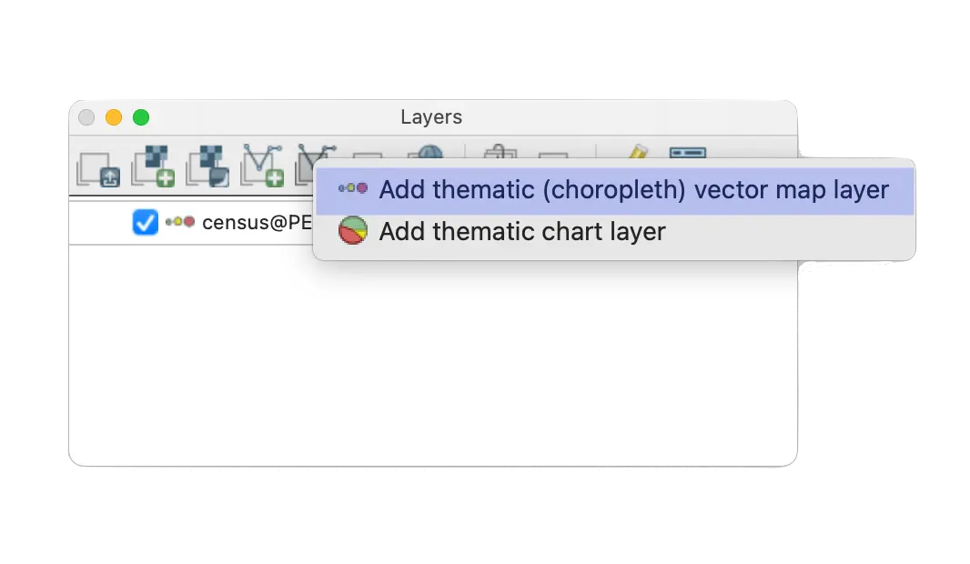
The thematic mapping tool can be accessed from the special vector layer icon in the layer manager.
It will create a new thematic vector layer.
Classification algorithms used in thematic mapping tool
| Code | *Statistical grouping algorithm |
|---|---|
| int | Classes are grouped by equal divisions of the column values, the minimum to the maximum value. |
| std | Classes are divided by standard standard deviations below and above the mean. |
| qua | Classes are grouped into quantiles such that each group represents approximately an equal number of cases (rows of a column). |
| equ | Classes have equal probabilities of occurrence in a normal/Gaussian distribution. |
| dis | Classes are divided by natural breaks in the values of a column. The algorithm systematically searches for discontinuities in the slope of the cumulative frequencies curve of column values, by approximating this curve through straight line segments whose vertices define the class breaks. |
*See the v.class manual for more detailed information.
You can also select the number of classes to be calculated and specify custom breakpoints for classes instead of using the algorithms listed above for statistically calculated breaks.
We can use the thematic mapping tool to generate a new map of household size from the census map, where the categories are determined by standard deviation units rather than the arbitrary ones used above.
Open the thematic mapping tool to create a new thematic map layer.
Under the Required tab, enter census for the the source of the information to create the thematic map.
Select HH_SIZE for the column to be classified in the thematic map.
Select 4 colors to use to visualize the standard deviation units. The example shown uses the interactive color picker (button to the right of the “Colors” entry box) to select:
- light blue (RGB 193:202:255:255) for 2-SD below the mean,
- dark blue (RGB 0:0:255:255) for 1-SD below the mean,
- dark red (RGB 251:2:7:255) for 1-SD above the mean, and
- light red (RGB 254:201:193:255) for 2-SD above the mean.
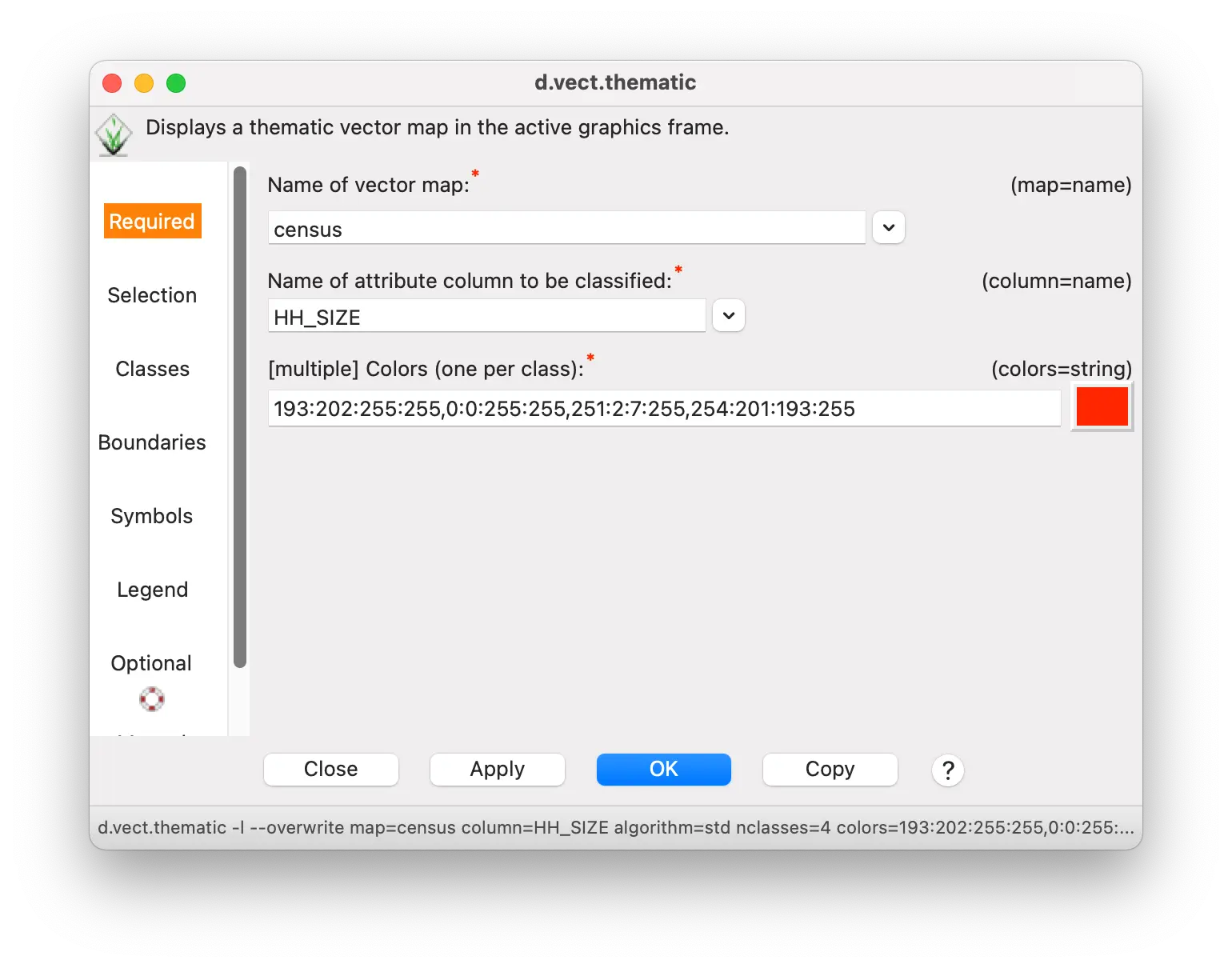
- Under the Classes tab, select std for the standard deviation “Algorithm to use for classification”, and 4 for the “Number of classes to define”.

Under the Legend tab, check the “Create legend information and send to stdout” box. This will send legend rules to the terminal (not the GUI console) that we will use later.
Enter Standard Deviation Units in the “Thematic map title” box. This will become a subtitle in the legend.
Click OK.
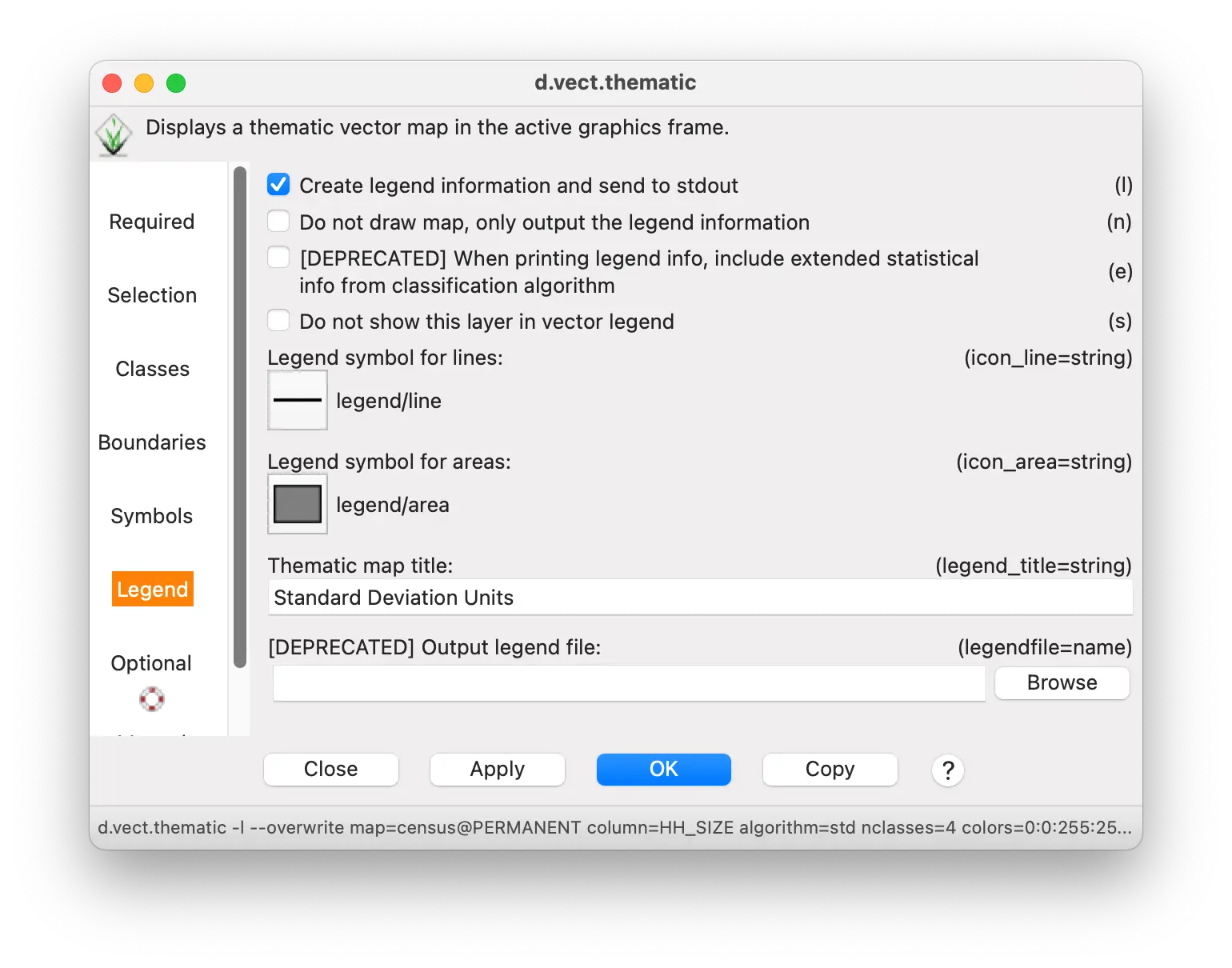
Enter values for creating the legend as you did with the previous thematic map of households, and also enter 13 for the subtitle font size.
Keep the scale bar as you defined it previously, if you desire.
d.vect.thematic -l map=census column=HH_SIZE algorithm=std nclasses=4 colors="193:202:255:255,0:0:255:255,251:2:7:255,254:201:193:255" boundary_color=0:0:0:255 legend_title="Standard Deviation Units"
d.legend.vect -b at=76,40 title="Median Household Size" fontsize=12 title_fontsize=16 sub_fontsize=13
d.barscale -n at=72,21 length=4 units=kilometers segment=4 width_scale=2gs.run_command("d.vect.thematic",
map="census",
column="HH_SIZE",
algorithm="std",
nclasses=4,
colors="193:202:255:255,0:0:255:255,251:2:7:255,254:201:193:255",
boundary_color="0:0:0:255",
legend_title="Standard Deviation Units",
flags="l")
gs.run_command("d.legend.vect",
at="76,40",
title="Median Household Size",
fontsize=12,
title_fontsize=14,
flags="b")
gs.run_command("d.barscale",
at="72,21",
length=10,
units="kilometers",
segment=5,
width_scale=2,
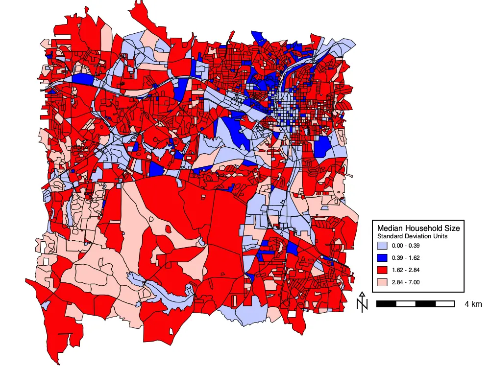
flags="n") And here is the map of census tracts classified by standard deviation units of household size.
Customizing the legend
While this map is useful as it is, the legend could be improved somewhat. The legend items could be displayed with the values below the mean toward the bottom and above the mean toward the top. Also, it would be helpful to indicate which values were 1 and 2 SD above and below the mean.
There is no way to do this in the thematic mapping tool. But the it can be done through editing the legend rules that are automatically generated by the tool and used by the vector legend tool. This the information that appeared in the GRASS terminal when the thematic mapping tool was run. It should look like this:
||||||Standard Deviation Units
0.00 - 0.39|legend/area|5|ps|193:202:255|0:0:0|1|area|803
0.39 - 1.62|legend/area|5|ps|0:0:255|0:0:0|1|area|185
1.62 - 2.84|legend/area|5|ps|251:2:7|0:0:0|1|area|1189
2.84 - 7.00|legend/area|5|ps|254:201:193|0:0:0|1|area|360These are a sequence of data fields separated by a pipe character |. Each line of the legend is represented by one line of legend rules fields.
Key to legend rules
| position | field | Explanation |
|---|---|---|
| 1 | label | Text that appears next to each color swatch in the legend. |
| 2 | symbol_name | Symbol used for the color swatch in the legend. |
| 3 | size | Size of the color swatch in the legend. |
| 4 | color_type | Order of the next two fields (positions 5 & 6) for the colors used for the color swatch. If the value of this field is ps (primary & secondary colors), the first field is for the fill and the second field is for the line/outline. If this field is lf (line & fill colors), the first field is the line/outline color and the second field is the fill color. Legends created by the thematic mapping tool use ps order, while legends created in other ways (e.g., as with the layer manager map) use lf order. Because this legend is created by the thematic mapping tool, these fields are fill color (position 5), followed by line color (position 6). |
| 5/6 | fill_color | Fill color of the color swatch. |
| 5/6 | feature_color | Line/outline color of the color swatch. |
| 7 | line_width | Width of the line/outline of the color swatch. |
| 8 | geometry_type | Vector object type being mapped. |
| 9 | feature_count | Count of cases (rows) in each category. |
You can edit these rules to change the appearance of your legend. To demonstrate, we will change the legend as proposed above.
Double click the vector legend to open the legend tool.
Under the In/Out tab, paste in the legend rules copied from the terminal.
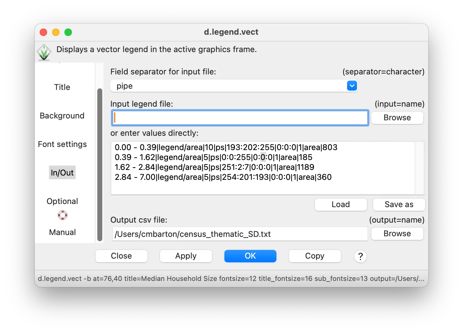
- Edit the rules so that they look like this:
||||||Standard Deviation Units
1SD to 2SD (2.84-7.00)|legend/area|5|ps|254:201:193|0:0:0|1|area|360
mean to 1SD (1.62-2.84)|legend/area|5|ps|251:2:7|0:0:0|1|area|1189
-1SD to mean (0.39-1.62)|legend/area|5|ps|0:0:255|0:0:0|1|area|185
-2SD to -1SD (0.00-0.39)|legend/area|5|ps|193:202:255|0:0:0|1|area|803Optionally, you can save the legend rules to a text file by entering the path and name in the “Output csv file” entry box. That way, you can load them to use again by selecting them in the “Input legend file” box.
Click OK.
Save the text output to the terminal to a text file (e.g., named census_legend.txt). Edit it in the text file and then load it to use in the legend.
d.legend.vect -b at=76,40 title="Median Household Size" fontsize=12 title_fontsize=16 sub_fontsize=13 input="[your path]/census_legend.txt"Save the text output to the terminal to a text file (e.g., named census_legend.txt). Edit it in the text file and then load it to use in the legend.
gs.run_command("d.legend.vect",
at="76,40",
title="Median Household Size",
fontsize=12,
title_fontsize=14,
sub_fontsize=13,
input="[your path]/census_legend.txt",
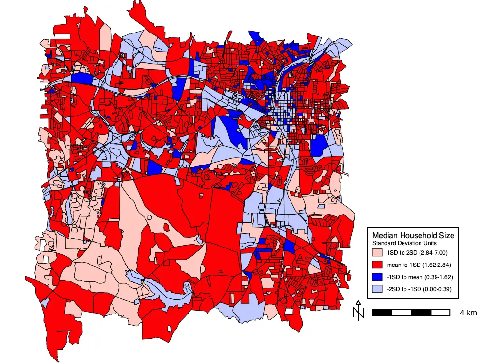
flags="b")Here is the thematic map with the customized legend
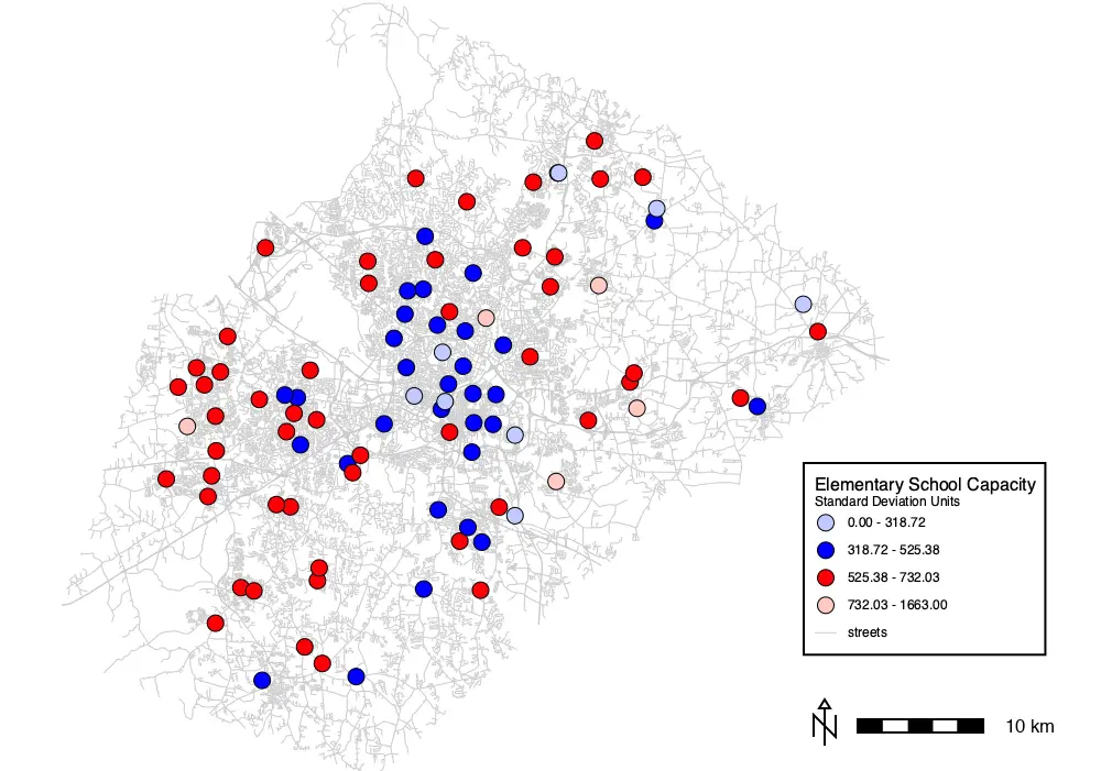
The thematic mapping tool can also make choropleth maps of vector points. For example, we can make a choropleth thematic map of elementary school capacity (schools vector points map) grouped by standard deviation units like the household size for census data. We only need to change a few settings.
Under the Required tab, change the “Name of the vector map” to schools and change the “Name of the attribute column” to CORECAPCI.
Under the Selection tab, enter GLEVEL=‘E’ in the “WHERE” box to select elementary schools.
Under the Symbols tab, change the “Point and centroid symbol” to basic/circle and set the size to 15 points.
Under the Legend tab, change the “Legend symbol for areas” to basic/circle to match the display symbol.
Click OK.
Add a legend and scale bar as you did for the other maps. You can edit the legend as we did for the census households map if desired.
d.vect.thematic -l map=schools column=CORECAPACI algorithm=std nclasses=4 colors="193:202:255:255,0:0:255:255,251:2:7:255,254:201:193:255" where=GLEVEL='E' boundary_color=0:0:0:255 icon=basic/circle size=15 icon_area=basic/circle legend_title="Standard Deviation Units"
d.legend.vect -b at=73,40 title="Elementary School Capacity" fontsize=12 title_fontsize=16 sub_font=14
d.barscale -n at=73,10 length=10 units=kilometers segment=5 width_scale=2gs.run_command("d.vect.thematic",
map="schools",
column="CORECAPACI",
algorithm="std",
nclasses=4,
colors="193:202:255:255,0:0:255:255,251:2:7:255,254:201:193:255",
where="GLEVEL='E'",
boundary_color="0:0:0:255",
icon="basic/circle",
size=15,
icon_area="basic/circle",
legend_title="Standard Deviation Units",
flags="l")
gs.run_command("d.legend.vect",
at="73,40",
title="Elementary School Capacity",
fontsize=12,
title_fontsize=14,
flags="b")
gs.run_command("d.barscale",
at="73,10",
length=10,
units="kilometers",
segment=5,
width_scale=2,
flags="n") Choropleth thematic map of elementary school capacities
Thematic charts
Thematic charts map
An alternative way to visualize quantitative geospatial information in GRASS is with thematic charts for vector points. The thematic charts tool, d.vect.chart, can display pie or bar charts at point locations.
Each pie segment or bar represents the value of a column for that point.
The size of a pie chart can also represent the value of a column.
In this way, the values of multiple columns can be visualized and compared across geographic space.
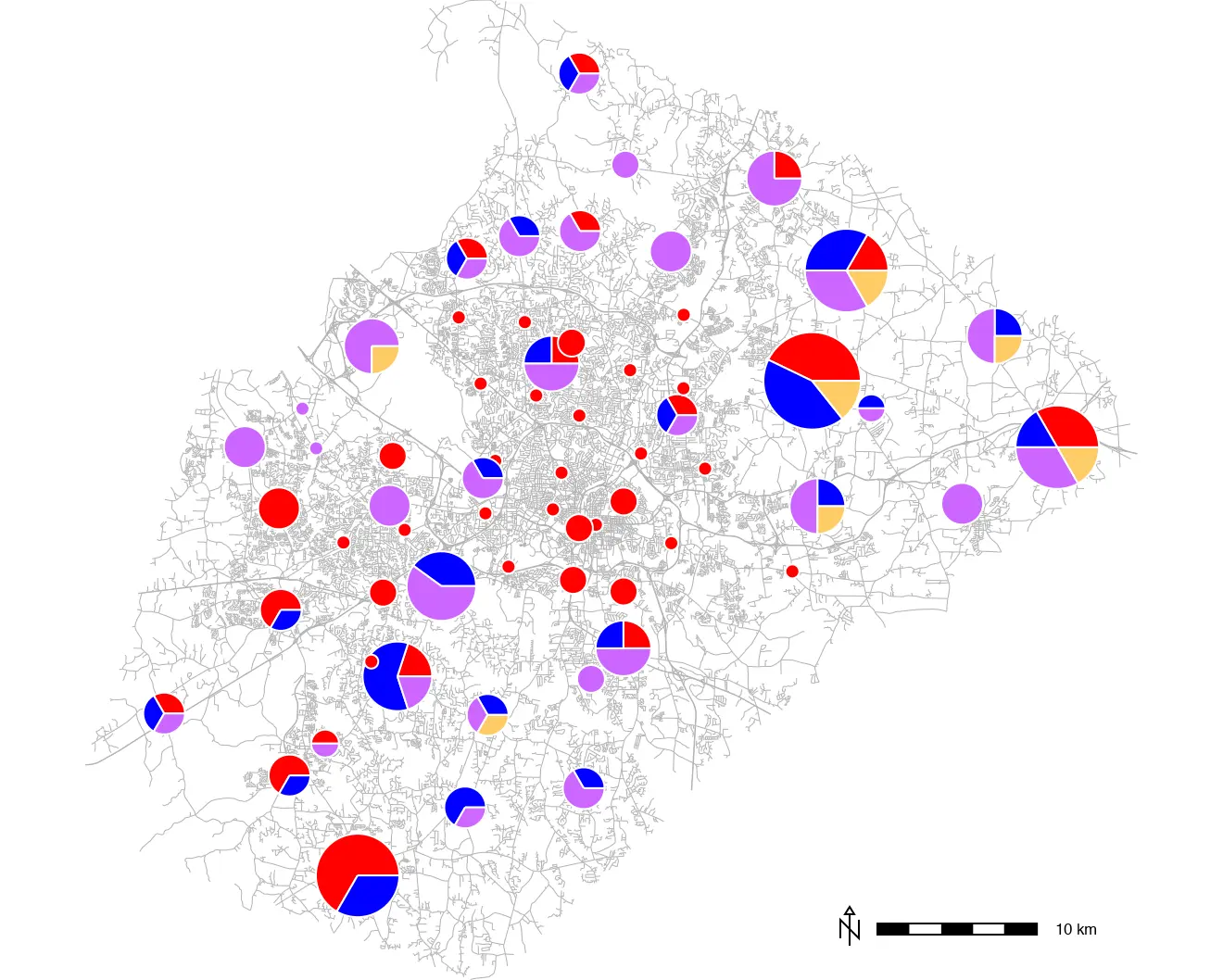
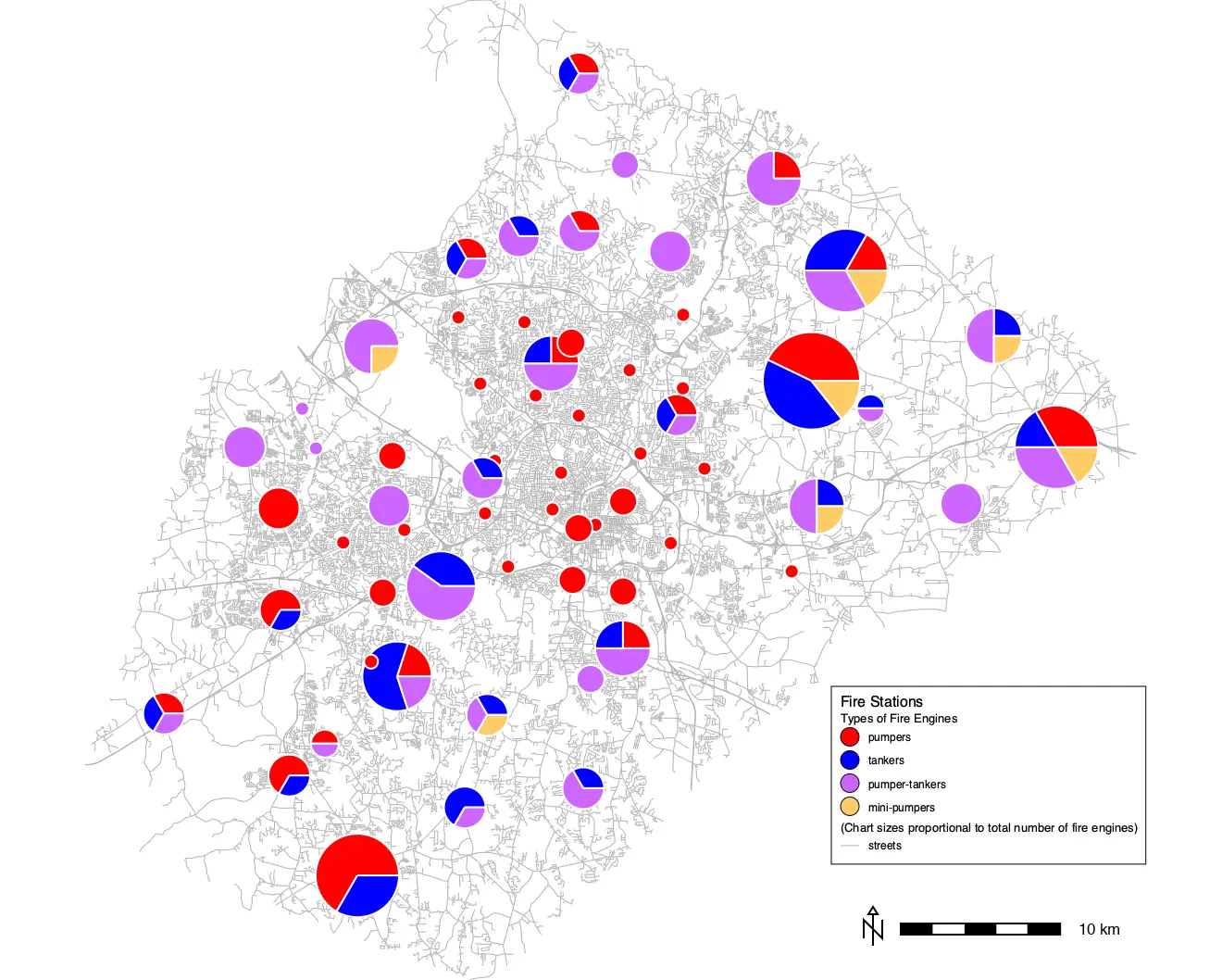
We can use thematic charts to display the equipment available at fire stations using the firestations vector map.
The fire stations can have several different types of equipment, listed in different columns of the firestations attribute table: pumpers (PUMPERS), tankers (TANKER), pumper-tankers (PUMPER_TAN), and mini-pumpers (MINI_PUMPE).
We can use the values in these columns to represent the proportion of each type of fire-fighting equipment in a thematic chart map.
The sum of these columns can be used for the size of a pie chart, reflecting the total equipment inventory.
- Open the thematic charts tool from the special vector layer icon in the layer manager.
- Under the Required tab, enter firestations for “Name of vector map”.

- Enter the names of columns PUMPERS,TANKER,PUMPER_TAN,MINI_PUMPE (separated by commas, no spaces) into the “Attribute columns containing data” entry box.
Under the Chart properties tab, enter pie for the “Chart type”.
Enter the equation PUMPERS + TANKER + PUMPER_TAN + MINI_PUMPE to use the total number of fire engines for the size of the pie charts.
Enter 15 in the “Scale for size” to get visually pleasing chart point sizes (15 X the sum of all the fire engines).
Enter white for the “Outline color” (255:255:255:255 as RGB and alpha/transparency).
Enter 4 colors to represent the 4 columns that are being displayed in the chart.
You can use the color picker button to the right of the entry box.
Or you can enter them manually as RGB color values or one of the named GRASS colors (red, orange, yellow, green, blue, indigo, violet, white, black, gray, brown, magenta, aqua, grey,cyan, purple). The colors should be separated by commas with no spaces.
The 4 colors used in this tutorial are: 255:0:0:255,0:0:255:255,204:102:255:255,254:204:102:255.
Finally, make sure that the “Create legend information” box is checked under the Optional tab.
Click OK.
d.vect.chart -c -l map=firestations columns=PUMPERS,TANKER,PUMPER_TAN,MINI_PUMPE size_column=PUMPERS+TANKER+PUMPER_TAN+MINI_PUMPE size=-1 scale=15 outline_color=255:255:255:255 colors=255:0:0:255,0:0:255:255,204:102:255:255,254:204:102:255gs.run_command("d.vect.chart",
map="firestations",
columns="PUMPERS,TANKER,PUMPER_TAN,MINI_PUMPE",
size_column="PUMPERS+TANKER+PUMPER_TAN+MINI_PUMPE",
size=-1,
scale=15,
outline_color="255:255:255:255",
colors="255:0:0:255,0:0:255:255,204:102:255:255,254:204:102:255",
flags="cl")Here is the thematic charts map of fire station capacities. It is underlain by a map of streets to show fire station localities, as we did with schools. It is clear that the smallest fire stations usually only have the same one kind of equipment. Slightly larger ones have the same one different kind of equipment. And the largest stations have the largest diversity of equipment. But what kind of equipment? We need a legend.
Creating a legend for a thematic charts map
The thematic charts tool can send legend information to the terminal (not GUI console) like the thematic mapping tool. But it is not in the correct format to immediately use in vector legend.
Here is the legend information output by the thematic charts tool for this map:
1|PUMPERS|255:0:0
2|TANKER|0:0:255
3|PUMPER_TAN|204:102:255
4|MINI_PUMPE|254:204:102We can use the procedures described above for a custom thematic map legend to make a legend for this thematic charts map. Here is are the legend rules we used previously:
||||||Standard Deviation Units
1SD to 2SD (2.84-7.00)|legend/area|5|ps|254:201:193|0:0:0|1|area|360
mean to 1SD (1.62-2.84)|legend/area|5|ps|251:2:7|0:0:0|1|area|1189
-1SD to mean (0.39-1.62)|legend/area|5|ps|0:0:255|0:0:0|1|area|185
-2SD to -1SD (0.00-0.39)|legend/area|5|ps|193:202:255|0:0:0|1|area|803We can edit these to
change the legend text,
change the legend object to a circle for the colors,
change the fill colors to match the ones output by the thematic charts tool,
reference the objects plotted as points rather than areas, and
delete the numbers of cases.
Here is what the new legend rules look like:
||||||Types of Fire Engines
pumpers|basic/circle|5|ps|255:0:0|0:0:0|1|area|
tankers|basic/circle|5|ps|0:0:255|0:0:0|1|area|
pumper-tankers|basic/circle|5|ps|204:102:255|0:0:0|1|area|
mini-pumpers|basic/circle|5|ps|254:204:102|0:0:0|1|area|
||||||(Chart sizes proportional to total number of fire engines)
streets|legend/line|5|lf|179:179:179:255|0:103:204|1|line|Note that we’ve added a line for streets too.
As we did above, you can open the vector legend tool, add a main title (Fire Stations), set the font sizes (16 for title, 14 for sub title, 12 for legend font), and optionally turn on the background.
Paste the new legend rules into the text box under the In/Out tab.
You can optionally give it a path to save these rules to a file to be reused in the future.
Click Apply or OK.
Save the legend rules to a text file (e.g., named firestations_legend.txt) and then load it to use in the legend.
d.legend.vect -b at=68,30 title="Fire Stations" border_width=1 fontsize=12 title_fontsize=16 sub_fontsize=13 input="[your path]/firestations_legend.txt"
d.barscale -n at=70.0,8.0 length=10 units=kilometers segment=5 width_scale=2Save the legend rules to a text file (e.g., named firestations_legend.txt) and then load it to use in the legend.
gs.run_command("d.legend.vect",
at="68,30",
title="Fire Stations",
fontsize=12,
title_fontsize=16,
sub_fontsize=14,
input="[your path]/firestations_legend.txt",
flags="b")
gs.run_command("d.barscale",
at="70.0,8.0",
length=10,
units="kilometers",
segment=5,
width_scale=2,
flags="n")The thematic charts map with a custom legend:
NoteMore legend customization
How could you add more lines to the custom legend to indicate the relationship between circle size and fire equipment inventory?
Remember that we scaled the circle size as 15x[total equipment]. The totals range from 0 to 7. So you could make new legend lines for 2, 4, & 6 equipment totals. To calculate the point size of each, simply multiply times 15, so that 2 engines = 30 pts, 4 engines = 60 pts, and 6 engines = 90 pts.
Then you can add 3 more lines to your custom legend like this one:
2 engines|basic/circle|30|ps|255:255:255|0:0:0|1|area|You could also begin this new section with a subtitle:
||||||Total Fire Engines at Each StationThe thematic charts tool can represent data as bar graphs instead of pie charts. Here is the same thematic charts map displayed as bar graphs. The “Size of chart” was set to 30, the “Outline color” set to black, and the symbol_name in the legend file set back to legend/area for this map.

Raster Thematic Maps
Raster thematic maps use color to represent varying land cover, land use, or terrain characteristics across a map. This can be characteristics like slope, represented in degrees, that varies continuously or like land cover, represented by areas of a map encoded with distinct categories.
Rasters with continuous variation: terrain slope
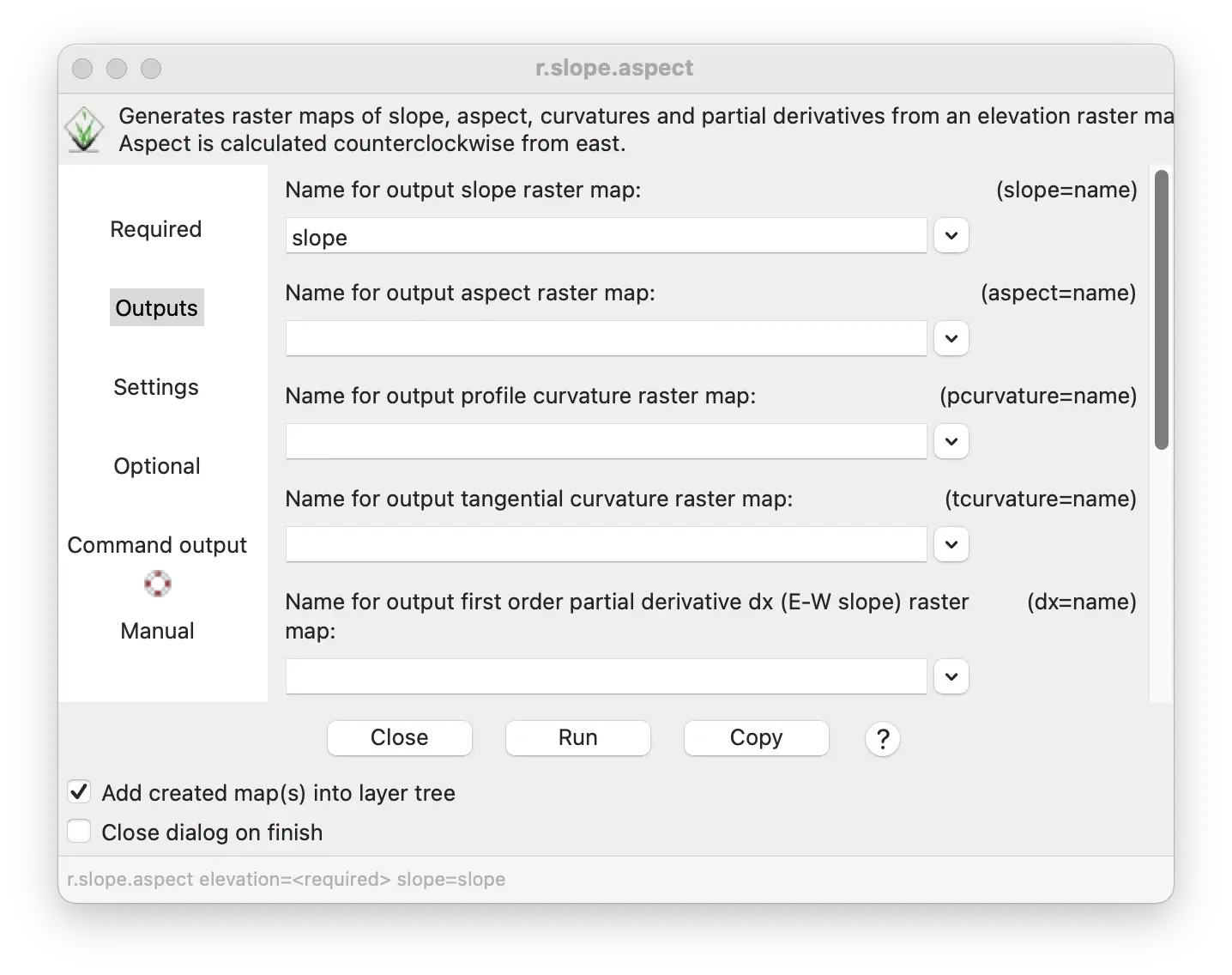
Terrain slope is an example of a characteristic represented by numeric values (in degrees) that vary continuously across a landscape. A map of slope can be created from an elevation map using the r.slope.aspect tool.
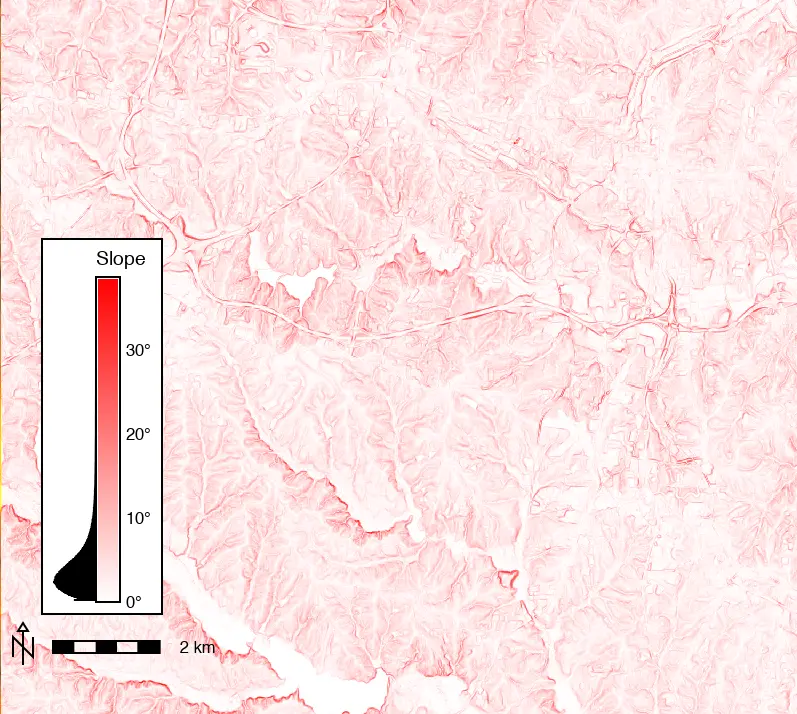
This will produce a map of continuously varying slope across the entire map. Colors can be assigned to raster cells according to their slope values to visualize areas of high and low slope. The slope that each color represents can be shown in a legend to help users interpret the map.
NoteModeling terrain in GRASS
To learn more about modeling and visualizing slope and other terrain characteristics in GRASS, see the Visualizing and Modeling Terrain from DEMs in GRASS tutorial. For more information about rasters in GRASS, see Raster data processing in GRASS.
First, create a slope map from the elevation DEM map.
Open r.slope.aspect tool from the Raster/Terrain analysis/Slope and aspect menu.
Set elevation raster layer as the “Name of input elevation raster map”.
Enter name slope for “Name for output slope raster map”.
Click Run.
r.slope.aspect elevation=elevation slope=slopegs.run_command("r.slope.aspect",
elevation="elevation",
slope="slope")Here is the resulting slope map.
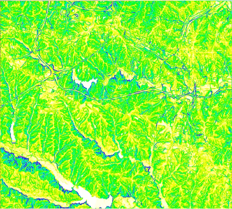
Selecting a color table
The default colors of the slope map we created vary from pale yellow to violet as slope changes from flat to steep. We can assign different color tables to represent variation in slope with different colors.
For example, we could change the intensity of a color to represent slope: pale color for low slopes and intense color for steep slopes.
Color tables can be assigned, and custom color tables defined, using the r.colors module.
Let’s apply the reds color table to the slope map so that the slope is represented by the intensity of the red color.
Select r.colors tool from the Raster/Manage colors menu.
In the “Map” tab, select the slope map in the “Name of raster map(s)” entry box.
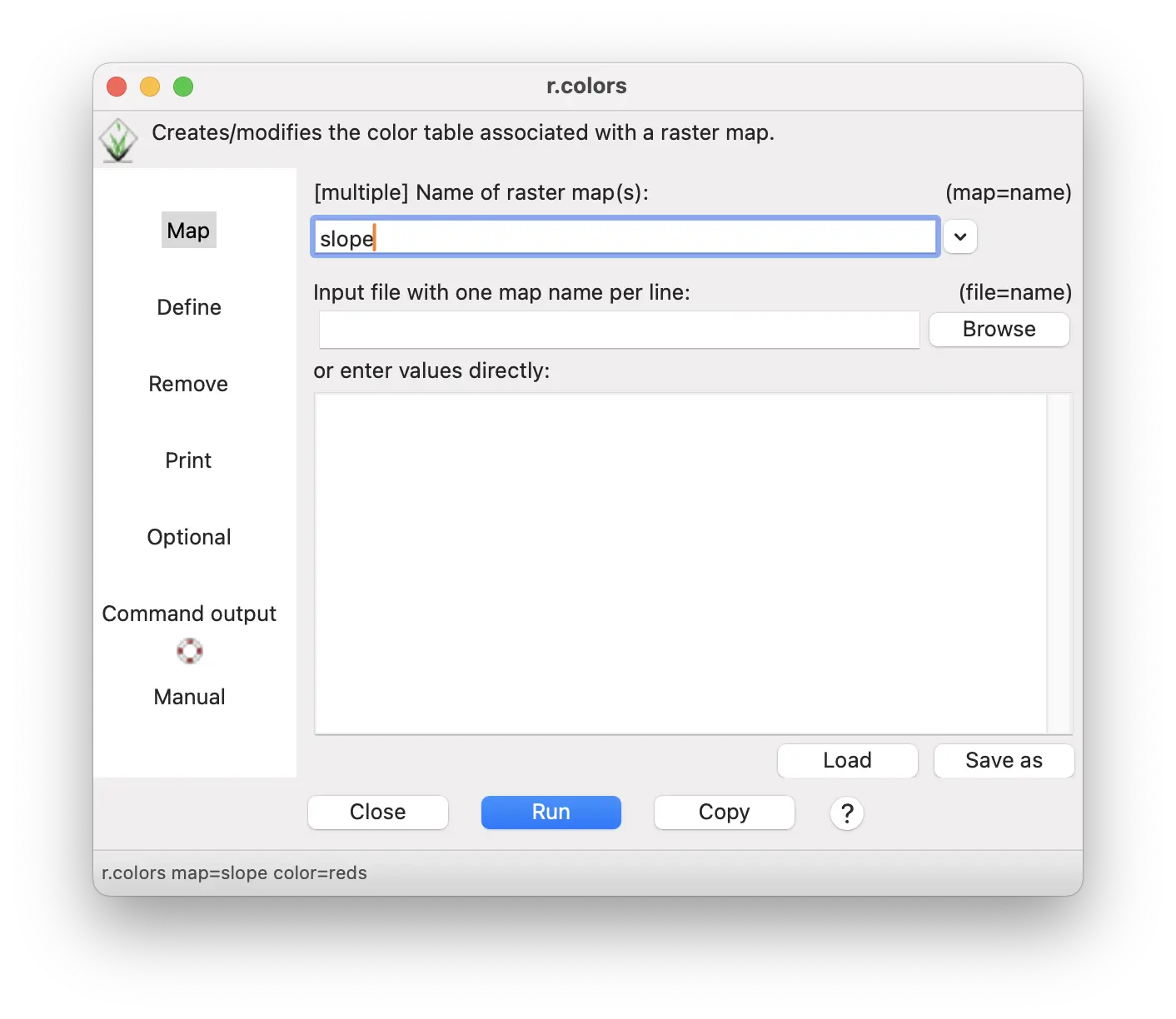
- In the Define tab, select reds as the color table.
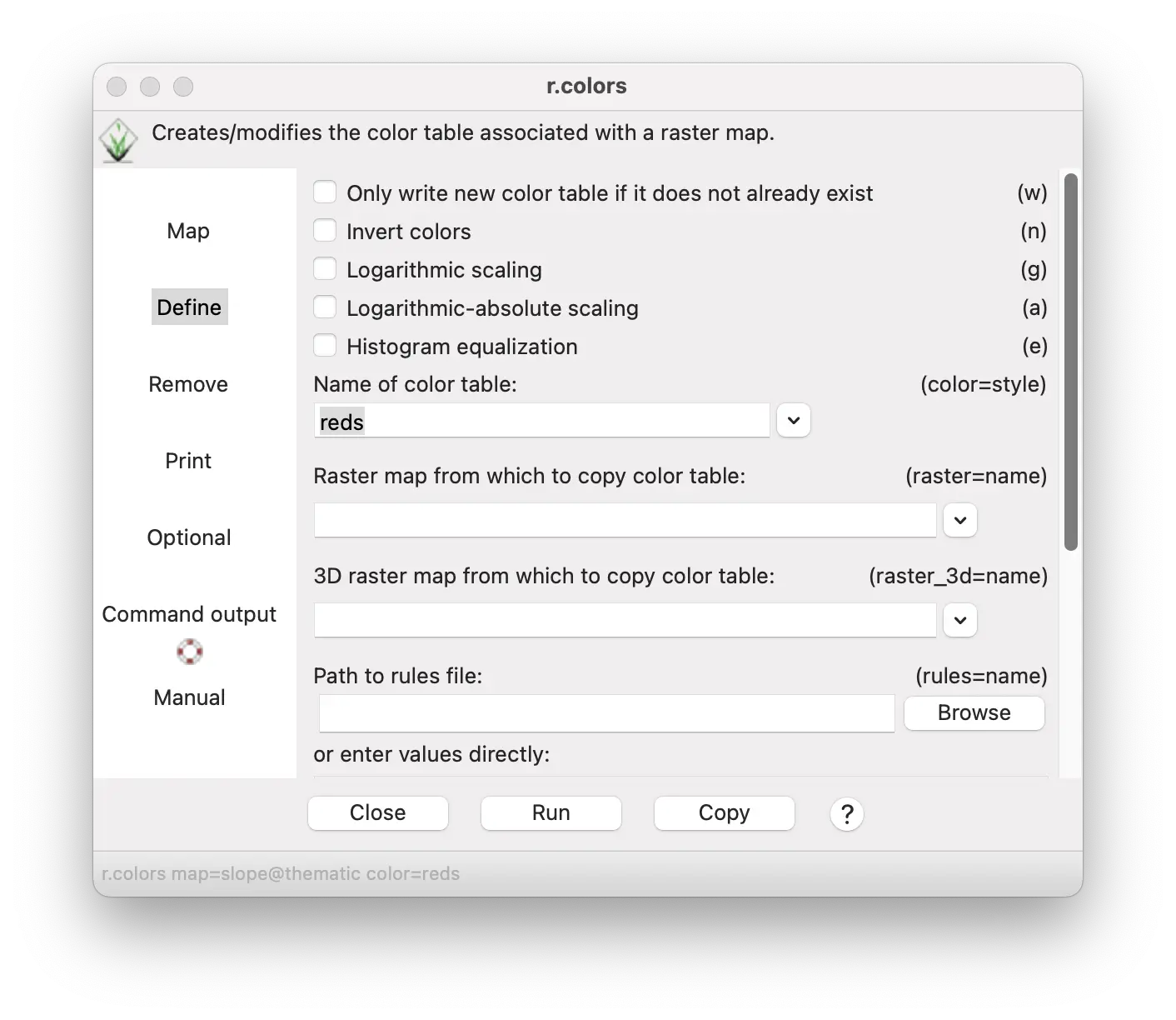
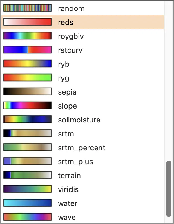
- Click Run.
r.colors map=slope color=redsgs.run_command("r.colors",
map="slope",
color="reds")
Try out some other color tables. The original default color is the slope color table. Try the gyr (green to yellow to red) color table with histogram equalization checked. You can also make a custom color table, as we describe later in this tutorial.
Creating a legend
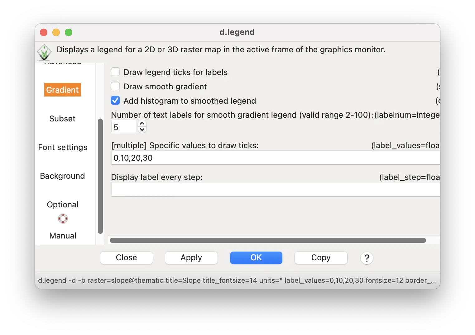
A legend can help you determine what the range of values present in your map and how the colors correspond to these values. The raster d.legend tool lets you easily make a highly informative legend for this map.
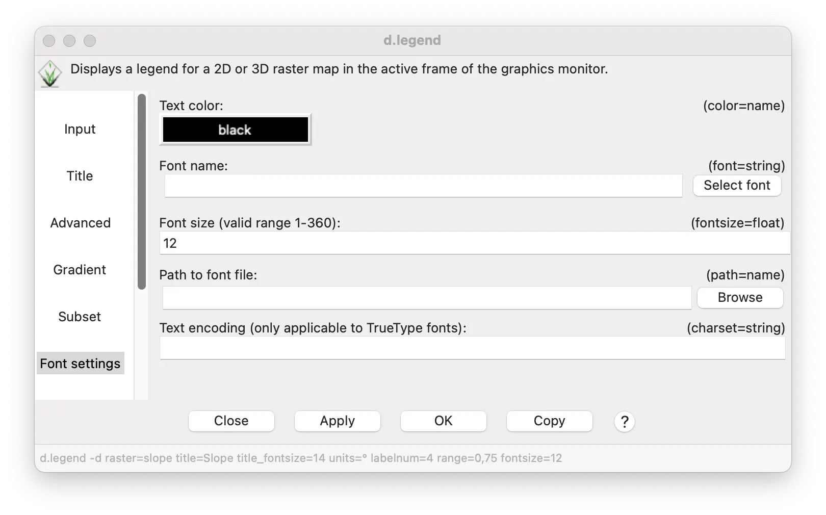
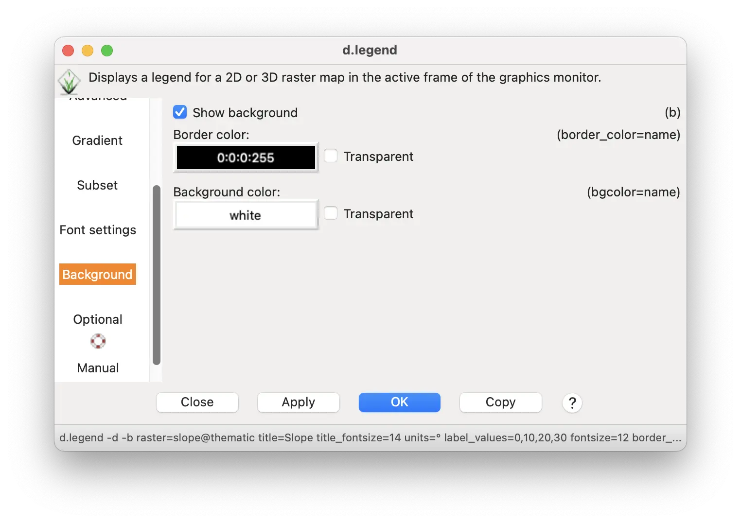
The raster d.legend tool can be accessed from the display window tool bar. This tool has many options. We’ll explore several of them.

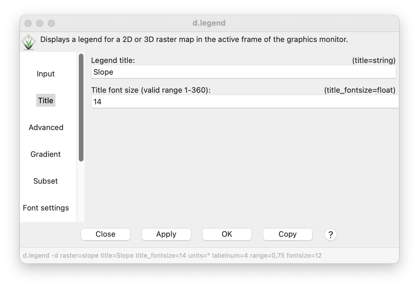
- Under the Input tab, enter slope as the “Name of raster map”.

- Under the Title tab, enter “Slope” as the “Legend title”, and enter 14 as the “Title font size”.
- Under the Advanced tab, enter the degree symbol (°) or the word “deg” as “Units to display”.
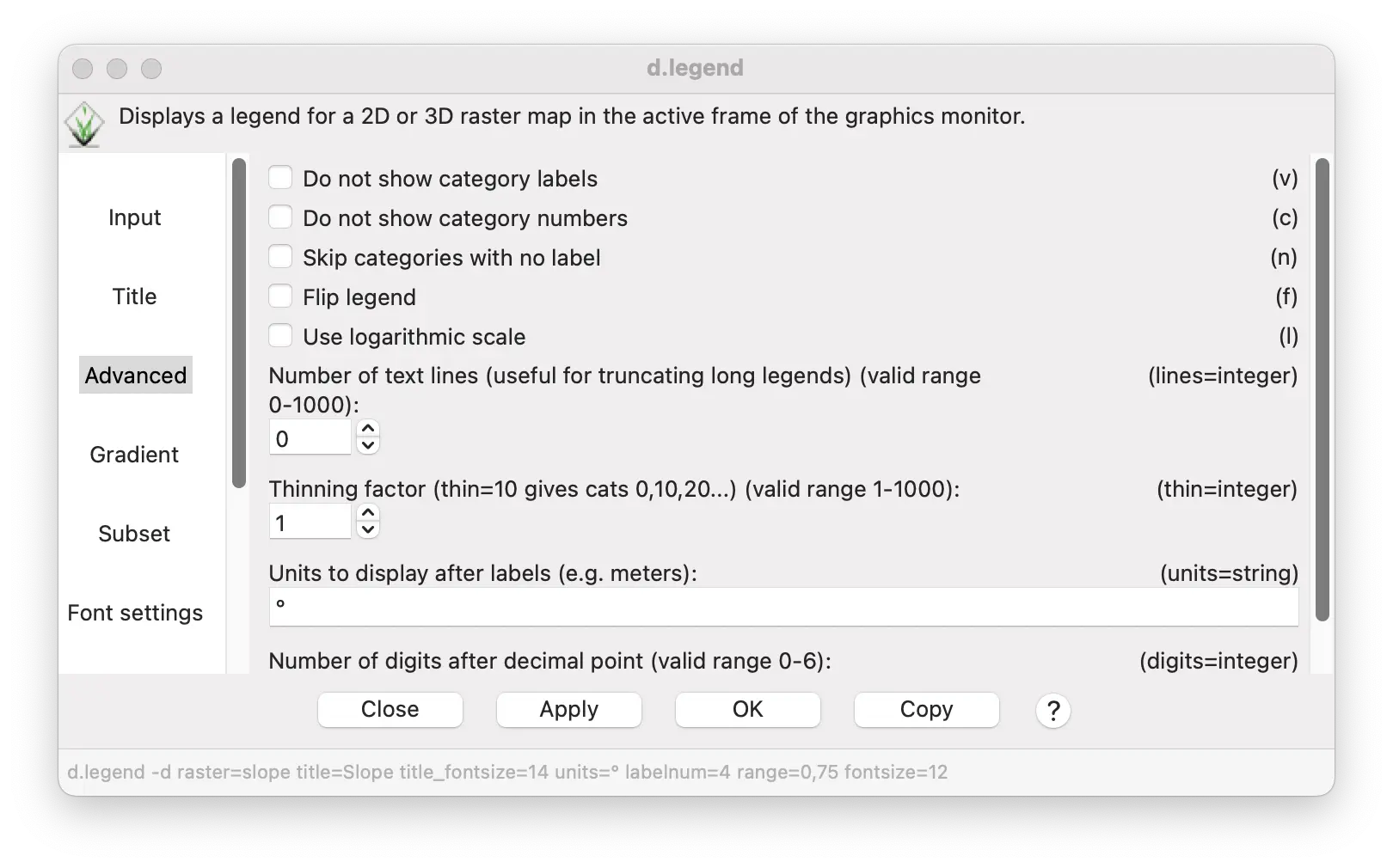
- Under the Gradient tab, check the “Add histogram to smoothed legend” box. Also enter 0,10,20,30 in the “Specific values to draw ticks” to display these evenly spaced values as legend ticks.
- Under the Font settings tab, enter 12 as the “Font size” for the legend.
Finally, under the Background tab, check the box to show the background.
Click OK to see the legend. You can reposition and resize the legend with a mouse or numerically under the Options tab.
A legend can be generated using the d.legend command.
A scale bar and north arrow can be generated using the d.barscale command.
d.legend -d -b raster=slope title=Slope title_fontsize=14 units=° label_values=0,10,20,30 fontsize=12 border_color=0:0:0:255
d.barscale -n length=2 units=kilometers segment=5 bgcolor=none width_scale=2A legend can be generated using the d.legend command.
A scale bar and north arrow can be generated using the d.barscale command.
gs.run_command("d.legend",
map="slope",
title="Slope",
title_fontsize=14,
units="°",
label_values="0,10,20,30",
fontsize=12,
border_color="0:0:0:255",
flags="db")
gs.run_command("d.barscale",
length=2,
units="kilometers",
segment=5,
bgcolor="none",
width_scale=2,
flags="n")Here is the result.
It not only shows the range of slope values and colors of different slope values, but also the histogram shows the number of cells for each slope value.
You can also add a scale bar and north arrow from the same menu bar item in the display window where you selected the legend tool.
Categorizing continuous variation
Sometimes it is useful to divide continuous variation into a set of distinct categories for analysis or communication. For example, the slope map we created previously might be displayed as areas of low slope and high slope, rather than a continuum of slope values. For raster maps, this is done in GRASS through reclassification of the cell values. While there are several ways to do this, the easiest is with the r.reclass tool, found under the Raster/Change category menu. Below, we will use r.reclass to create a map of distinct slope categories from the slope map we produced previously.
Statistics for categories
How should we group slope into categories? One way is to use statistical analysis to divide slope statistically into quartiles, each of which represents the same number of raster cells. GRASS has numerous tools for statistical analyses of raster and vector maps.
The r.univar tool can be used to find the cutoff values for the 1st, 2nd, 3rd, and 4th quartiles.
We could define the 1st quartile (25% of raster cells with the lowest slopes) as ‘low slope’, the 4th quartile (25% of cells with the highest slopes) as ‘high slope’, and the remaining cells as ‘intermediate slope’ (2nd and 3rd quartiles, representing the 50% of cells with intermediate slopes).
Open r.univar (“Univariate raster statistics”) from the Raster/Reports and Statistics menu.
Enter slope as the “Name of the raster map(s)” under the Required tab.
Under the Extended tab, enter 25,50,75 for “Percentile to calculate”.
Click run.
r.univar map=slope percentile=25,50,75gs.run_command("r.univar",
map="slope",
percentile="25,50,75")Here is the result:
n: 2019304
minimum: 0
maximum: 38.6894
range: 38.6894
mean: 3.86452
mean of absolute values: 3.86452
standard deviation: 3.00791
variance: 9.04755
variation coefficient: 77.834
% sum: 7803645.55388512
1st quartile: 1.85464
median (even number of cells): 3.21512
3rd quartile: 5.02421To divide slope into quartiles, we need to create the following slope groups:
| slope | quartile | slope category |
|---|---|---|
| 0-1.85464 | 1st quartile | low slope |
| 1.85465-5.02421 | 2nd & 3rd quartiles | intermediate slope |
| 5.02422-38.6894 | 4th quartile | high slope |
Reclassification
Now we can use the results of the above statistical analysis to reclassify slope into three categories Two of these categories each represent 25% of the cells with the highest and lowest slopes; the third, intermediate category represents 50% of the total cells.
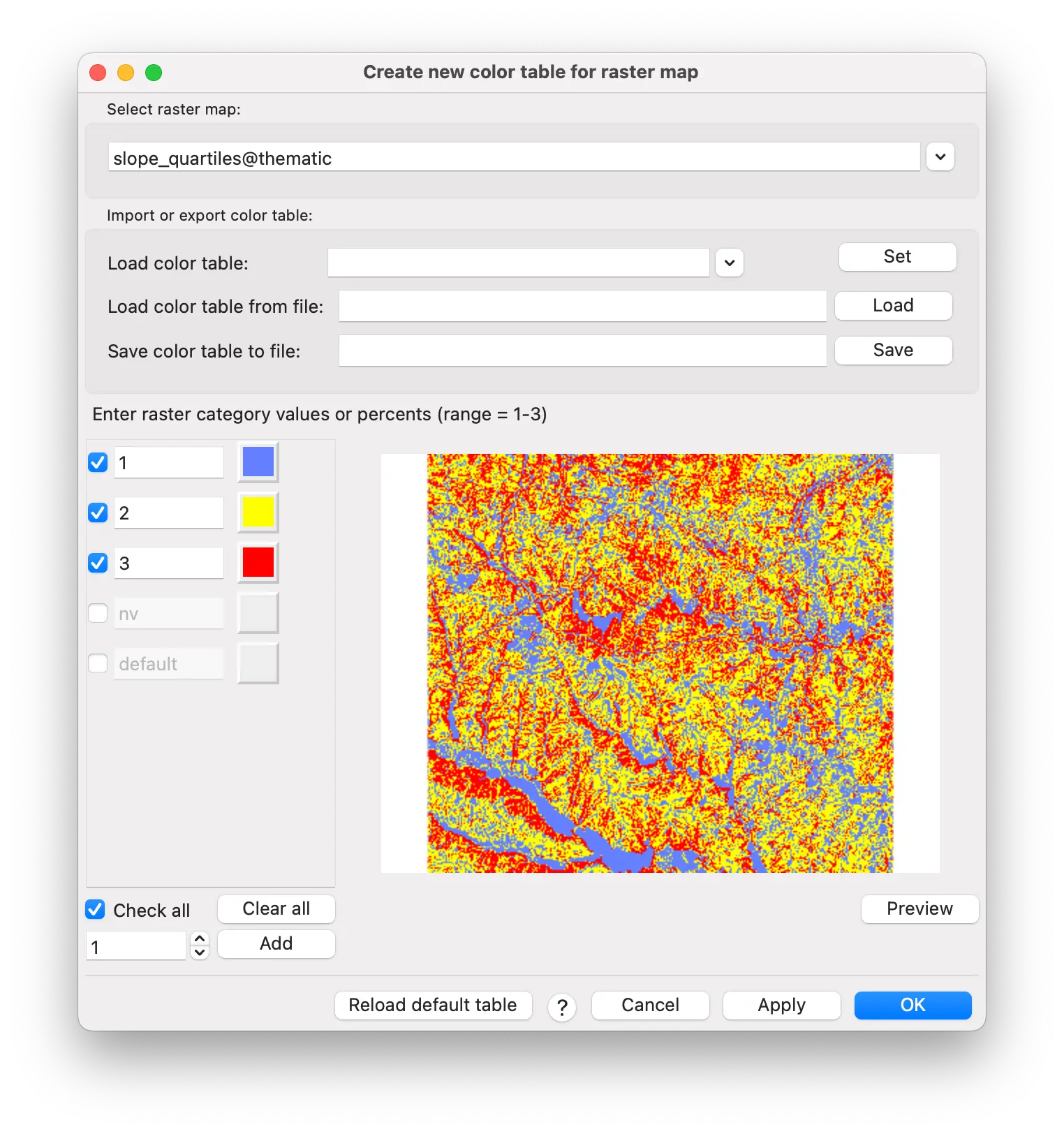
The r.reclass tool is found under the Raster/Change category menu.
Enter slope for the raster to be reclassified.
Enter slope_quartiles for the output reclassified map.
Enter the reclass rules directly in the text box or from a saved text file. Use and * symbol to represent everything not covered by the specific reclass rules.
Click run.
0 thru 1.85464 = 1 low slope
1.85465 thru 5.02421 = 2 intermediate slope
5.02422 thru 38.6894 = 3 high slope 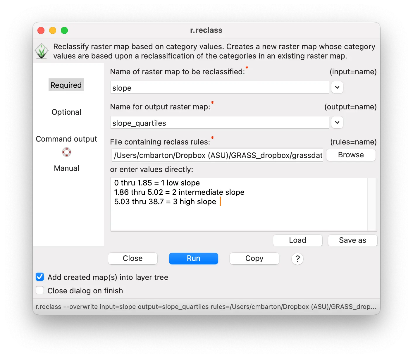
r.reclass input=slope output=slope_quartiles rules=- << EOF
0 thru 1.85464 = 1 low slope
1.85465 thru 5.02421 = 2 intermediate slope
5.02422 thru 38.6894 = 3 high slope
EOFrules = """\
0 thru 1.85464 = 1 low slope
1.85465 thru 5.02421 = 2 intermediate slope
5.02422 thru 38.6894 = 3 high slope
"""
gs.write_command("r.reclass",
input="slope",
output="slope_quartiles",
rules="-",
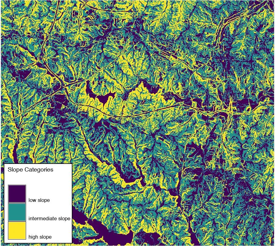
stdin=rules)This creates a new map named slope_quartiles with slope divided into three categories.
Assigning a custom color table
This map is helpful for showing areas with different slope categories. But it might be more interpretable with a different set of colors. We could pick a different pre-defined color table using the r.colors tool demonstrated previously. We can also define a custom color table using the same tool.
Creating a custom color table is as easy as specifying a category number followed by a color.
The color can be one of the named colors that GRASS recognizes (red,orange,yellow,green,blue,indigo,violet,white,black,gray,brown,magenta,aqua,grey,cyan,purple) or
the color can be specified as RGB values (0-255 for red:green:blue) or as hex number.
For example, to create a color table using aqua, yellow, and red for categories 1-3 in the slope_quartiles map, you simply need to list them as:
1 aqua
2 yellow
3 red- To specify the same colors as RGB, you would write the rules as:
1 100:128:255
2 255:255:0
3 255:0:0- As hex color values, you would write the rules as:
1 #6480ff
2 #ffff00
3 #ff0000You can save this to a plain text rules file and upload it in r.colors or you can specify it directly within the r.colors tool.
- Specify slope_quartiles as the map you want to assign the color table to

Enter the color rules in the “enter values directly” box
Press run
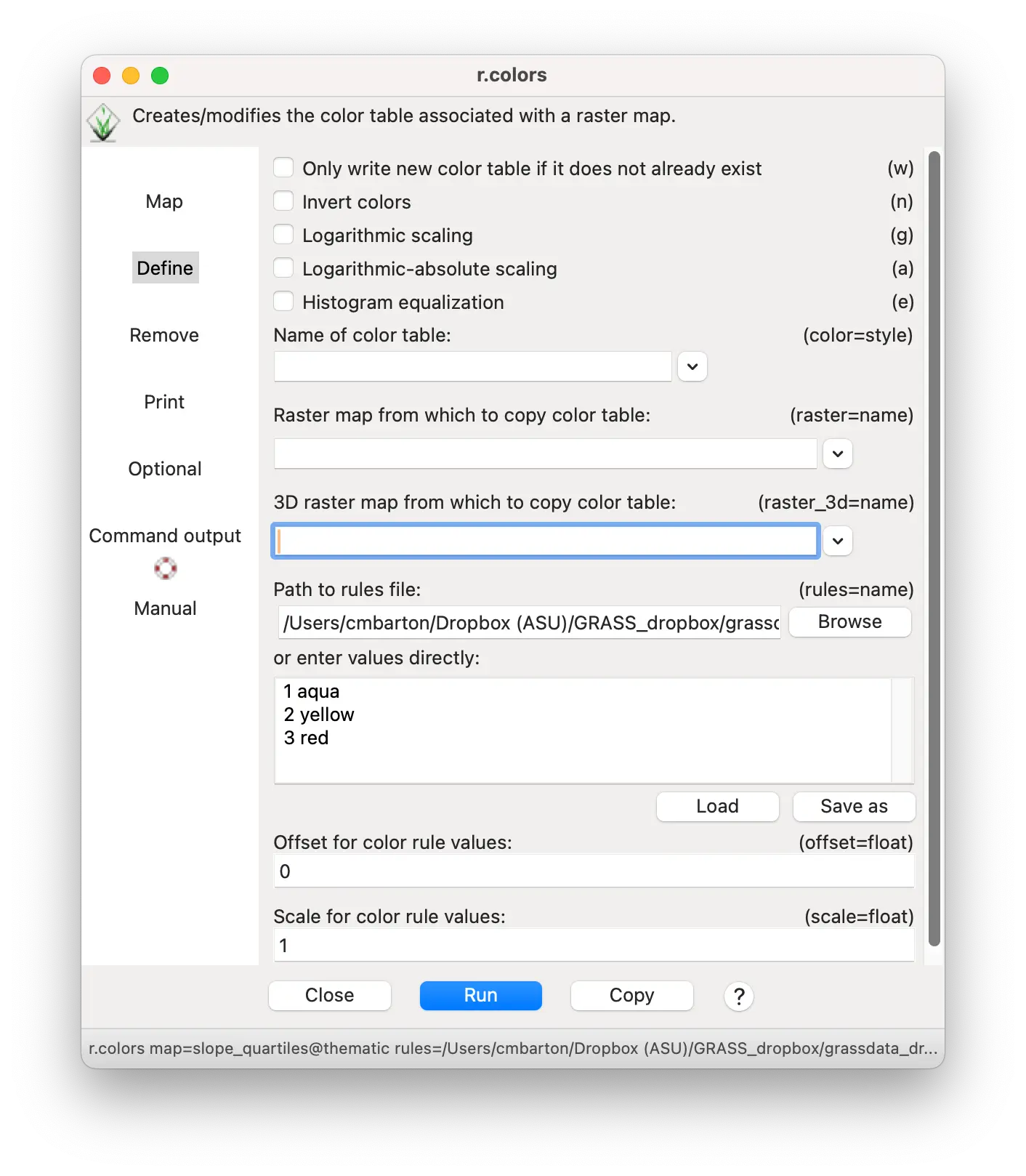
You can also specify color rules interactively by selecting Raster/Manage colors/Manage color rules interactively
r.colors -e map=slope_quartiles rules=- << EOF
1 aqua
2 yellow
3 red
EOFrules = """\
1 aqua
2 yellow
3 red
"""
gs.write_command("r.colors",
map="slope_quartiles",
rules="-",
stdin=rules)Here is the resulting Slope quartile categories map with a custom color table.

Rasters with distinct categories: land cover
In addition to contiuous values, raster cells can represent distinct categories, encoded with an integer value and a text label. When these categories are assigned different colors, this kind of thematic map is also called a choropleth map.
The landuse96_28m map is an example of such a raster map. Load the landuse96_28m map into the layer manager.
Because the colors vary according to category, it can already be seen as a raster thematic map. All that is lacking is an interpretive legend.
You can make a legend for the landuse96_28m map in the same way we made a legend for the slope map, with a few minor differences.
In the d.legend tool select landuse96_28m for the map to create a legend from.
Put “Land Use” in the title and set the title font size to 14.
Under the Advanced tab, check the “Do not show categories number” box (you might want to show the numbers for a different map, however).
Set the font size to 12.
Check the “Show background” box.
Click “OK”.
d.legend -c -b raster=landuse title="Land Use" title_fontsize=14 fontsize=12 border_color=0:0:0:255gs.run_command("d.legend",
raster="landuse",
title="Land Use",
title_fontsize=14,
fontsize=12,
border_color="0:0:0:255",
flags="cb")Here is the land use thematic map.
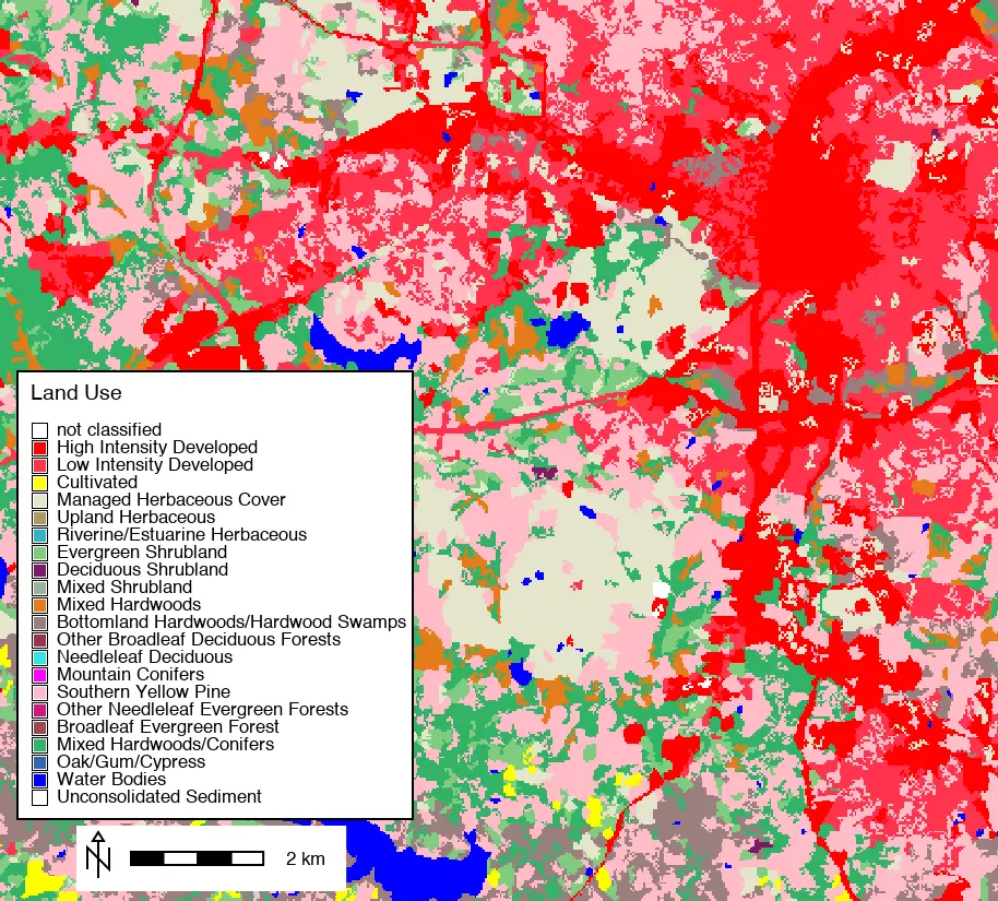
NoteTip
If you have a category map with very many categories, they may not be readable or even display as distinct categories. If you have a map with too many categories to create a readable legend, you may want to combine some categories or focus on a smaller geographic area to produce a useful thematic map.
Aggregating categories with reclassification
This thematic map might be more informative if the many land use and land cover categories could be condensed into fewer. As with the slope map, this can be done through reclassification to assign new values and labels to the existing land use categories.
We can make a new reclass map with aggregated categories, named landcover. Using r.reclass as described previously, we can reduce the 21 original categories to 7 by combining all the developed land into a single category, all the herbaceous vegetation, all the shrub vegetation, and all the tree cover.
Enter landuse96_28m for the raster to be reclassified.
Enter landcover for the output reclassified map.
Enter the reclass rules directly in the text box or from a saved text file.
1 2 = 1 developed
3 = 2 agriculture
4 6 = 3 herbaceous
7 thru 9 = 4 shrubland
10 thru 18 = 5 forest
20 = 6 water
21 = 7 sedimentr.reclass input=landuse output=landcover rules=- << EOF
1 2 = 1 developed
3 = 2 agriculture
4 6 = 3 herbaceous
7 thru 9 = 4 shrubland
10 thru 18 = 5 forest
20 = 6 water
21 = 7 sediment
EOFrules = """\
1 2 = 1 developed
3 = 2 agriculture
4 6 = 3 herbaceous
7 thru 9 = 4 shrubland
10 thru 18 = 5 forest
20 = 6 water
21 = 7 sediment
"""
gs.write_command("r.reclass",
input="landuse",
output="landcover",
rules="-",
stdin=rules)Here is the result with a legend.
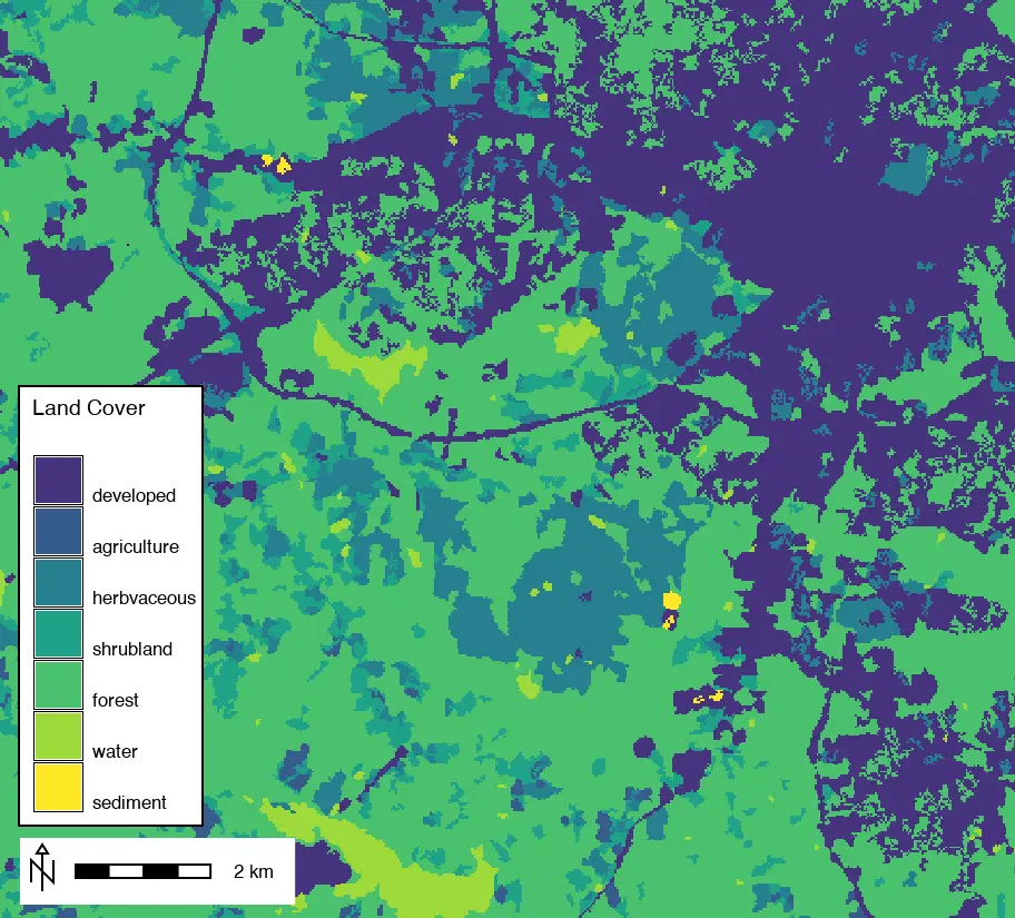
Custom colors for reclassified thematic map
Finally, we might want to change the colors from the default viridis color table to one that better shows land cover categories. This can be done using the r.colors described previously for the reclassified slope map.
Here are some possible color assignments. Developed land (1) is orange, agricultural land (2) is yellow, other vegetation (3-5) is colored shades of green, water (6) is blue, and sediment (7) is brown. Assign these colors using r.colors as done previously for reclassified slope.
Specify landcover as the map you want to assign the color table to
Enter the color rules in the “enter values directly” box
1 255:127:0
2 255:255:0
3 200:255:0
4 0:255:0
5 20:130:70
6 0:191:191
7 191:127:63- Press run
r.colors map=landcover rules=- << EOF
1 255:127:0
2 255:255:0
3 200:255:0
4 0:255:0
5 20:130:70
6 0:191:191
7 191:127:63
EOFrules = """\
1 255:127:0
2 255:255:0
3 200:255:0
4 0:255:0
5 20:130:70
6 0:191:191
7 191:127:63
"""
gs.write_command("r.colors",
map="landcover",
rules="-",
stdin=rules)Here is the resulting reclassified and recolored land cover map.

Summary
Besides the approaches presented here, there are other ways of creating thematic maps in GRASS. For vector maps, graduated points and lines, with point size and line width proportional to a numeric variable, can be created in the vector properties tool (d.vect). Color tables can be assigned to a numeric vector column in the same way as color tables can be assigned to raster maps. In both cases, it will be necessary to create custom legends for these vector thematic maps following procedures described above. The important point is that GRASS can be used to create sophisticated, high-quality thematic maps from both raster and vector geospatial data.
© Michael Barton 2026 The development of this tutorial was funded in part by the US National Science Foundation (NSF), award 2303651.